How to Add a Custom Component for WebHelp Output
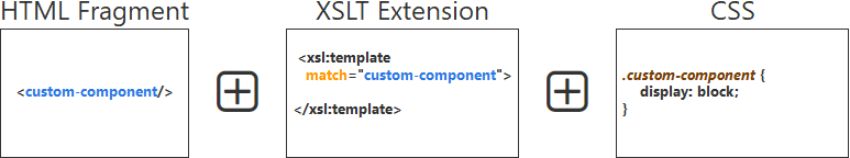
This topic explains how to use several customization methods to define and implement a custom component for WebHelp output pages.
Predefined components
The WebHelp output is based on a set of HTML Page Layout Files that define the default layout of the generated pages. Each layout file is made of a set of various components. Each component is described using an associated XML element that is processed at the generation time resulting in its associated component being included in the output pages.
Here are a few examples of predefined components: Logo, Title, Menu, Search Input, Topics Tiles, Topic Breadcrumb, Topic Content, Publication Table of Contents. A complete list with all the available components is available here: Layout of the Responsive Page Types.
<!-- Search form -->
<whc:webhelp_search_input class="navbar-form wh_topic_page_search search" role="form"/>
At publishing time, the above component will be expanded into:
<div class=" wh_search_input navbar-form wh_topic_page_search search">
  <form id="searchForm" method="get" role="search" action="../search.html">
    <div>
      <input type="search" placeholder="Search "
        class="wh_search_textfield ui-autocomplete-input" id="textToSearch"
        name="searchQuery" aria-label="Search query" required="required"
        autocomplete="off"/>
      <button type="submit" class="wh_search_button" aria-label="Search">
        <span class="search_input_text">Search</span>
      </button>
    </div>
  </form>
</div>
Customization Methods
- Apply custom CSS styles to change the default layout and styles.
- Insert additional HTML content using one of the available HTML Fragment Placeholder parameters.
- Extend the default processing using XSLT Extension Points.
- Configure available Transformation Parameters.
Use Case: Custom Link Component
For the subsequent procedure, suppose you have a DITA project for a User Manual and you also have various video demonstrations available on your website that supplement the documentation. You may want to link a video demonstration for a particular feature it its associated DITA topic in the WebHelp output.
You could simply add a link somewhere in your DITA topic, but this approach would not be very suitable for a printable (PDF) version of your User Manual. Thus, you need to include the link to the associated video demonstration only in the WebHelp output of your User Manual (and not the PDF version).
<prolog>
   <metadata>
      <othermeta name="video-link" content="https://www.youtube.com/watch?v=zNmXfKWXwO8"/>
   </metadata>
</prolog>
Next, you need to instruct WebHelp to pick up the URL from the metadata and generate a link in a specific location of the HTML output page. You can achieve this by creating your own WebHelp custom component.
Creating a Custom Component
You can combine several of the available customization methods to define and implement your own WebHelp custom component.
To create a custom component that displays a link to the current topic's associated video tutorial, follow these steps:
- Define your component. For example, it may have the following form:
<comp:video-link xmlns:comp="http://example.com/custom-components"/>
The component is an XML element that belongs to a custom defined namespace. - Insert the component in your topic pages. To do this, you will have to save the associated XML element in an HTML Fragment file (for example, named video-link-fragment.xml).
- Reference the HTML Fragment file in your current Publishing
Template's descriptor file and associate it with an HTML Fragment placeholder
that is available for the topic pages
(
webhelp.fragment.before.topic.toolbarin this case):<html-fragments> <fragment file="component/html-fragment/video-link-fragment.xml" placeholder="webhelp.fragment.before.topic.toolbar"/> </html-fragments>
Note: The HTML Fragment file is referenced using a path relative to the Publishing Template root directory. - Create a custom XSLT file that processes the custom component and picks up the video URL
available in the current topic's metadata and generates a link to the page that contains
the
video:
<xsl:stylesheet xmlns:xsl="http://www.w3.org/1999/XSL/Transform"
    xmlns:xs="http://www.w3.org/2001/XMLSchema"
    xmlns:comp="http://example.com/custom-components"
    exclude-result-prefixes="xs comp"
    version="3.0">

    <!-- Custom component implementation -->
    <xsl:template match="comp:video-link" mode="copy_template">
        <xsl:param name="ditaot_topicContent" tunnel="yes"/>
        <!-- Look for a 'video-link' <meta> element in the current topic content -->
        <xsl:variable name="videoLinkMeta"
              select="$ditaot_topicContent//*:meta[@name='video-link']"/>
        <xsl:if test="exists($videoLinkMeta)">
            <div class="video-link-container">
                <a href="{$videoLinkMeta[1]/@content}"
                   class="video-link" target="_blank" aria-label="Video">
                    <span>Video</span>
                </a>
            </div>
        </xsl:if>
    </xsl:template>

</xsl:stylesheet>
The HTML content generated for your component will look like this:<div class="video-link-container"> <a href="https://www.youtube.com/watch?v=zNmXfKWXwO8" class="video-link" target="_blank" aria-label="Video"> <span>Video</span> </a> </div>
- Reference the above XSL file in your Publishing Template's descriptor file using the
XSLT extension point associated with the XSL module that generates an HTML file for each
DITA topic:
<xslt> <extension file="component/xsl/video-link-impl.xsl" id="com.oxygenxml.webhelp.xsl.dita2webhelp"/> </xslt> - Create a custom CSS file that contains the rules for styling the output for your
component:
@import url('https://fonts.googleapis.com/icon?family=Material+Icons');

.video-link-container {
    display: flex;
    align-items: center;
    flex-grow: 10;
    justify-content: flex-end;
}

.video-link {
    display: flex;
    align-items: center;
    color: #fff !important;
}

.video-link:before {
    content: "smart_display";
    font-family: 'Material Icons';
    font-size: 20px;
    display: inline-block;
    word-wrap: normal;
    white-space: nowrap;
}

.video-link span {
    display: none;
}

.wh_right_tools {
    padding: 0;
}
- Reference the above CSS file in your Publishing Template's descriptor
file:
<resources>
    <!-- .... -->
    <css file="component/css/video-link.css"/>
</resources>
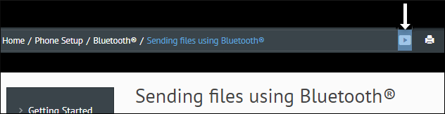
Result: An icon that is a link to the video appears in the header stripe in the output page.
Sample Publishing Template
A sample Publishing Template that contains all the above customizations is available here: https://github.com/oxygenxml/oxygen-publishing-template-samples/tree/master/templates/video-link-custom-component.